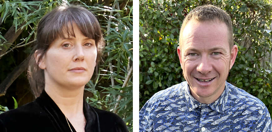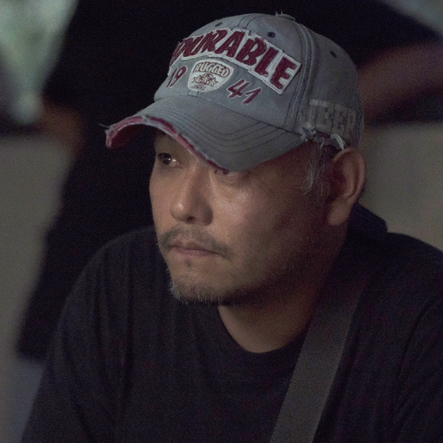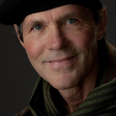
Shona Heath and James Price

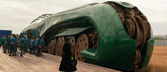
Shona Heath and James Price won Oscars for co-production designing Poor Things, one of the most visually unique, dreamlike movies seen in years. Shona came straight from the fashion world, having never designed a movie before, and James had never designed anything on this scale, but the alchemy of their collaboration made mind-bending magic happen onscreen.

AS: How involved was director Yorgos Lanthimos in the look of the movie Poor Things? How much did he tell you the film had to look a certain way and how much did he just let you go?
SH: He let us go right from the beginning with near enough no direction other than five paintings and a very strict rule that we had to make everything we possibly could. That greenscreen was just not an option. Visual effects were the very last, desperate option. That’s why we ended up with miniatures, skies on LED screens, painted backdrops, all those things.

But he was consistently there very early on in the concepting phase. He really did nurture the seeds that he liked. It grew up around us all and he was very much involved and steering it. The honest answer is nobody knew, until it grew and became more finished, that we did have a world, we did have a direction. There was a feeling to everywhere and it was all linked, and it wasn’t as disparate as it was when you first start off. It feels like this scatter-bomb approach, which feels quite mad, but actually when James and I look back to the very first documents we did, Poor Things was there in the first couple of months.

AS: Some production designers talk about how you “crack the code” of a script or project, that “aha moment” where everything falls into place. Did you ever feel like you experienced that on Poor Things?
SH: I do remember struggling with what the hall was, what the texture or the painting of the hall was in Baxter’s house and Yorgos kept saying, That looks like a renovation, that looks like a restaurant! Then when we got that really deep texture that also had a scenic backdrop painted on top of the texture, he said, Yes, that could work. I remember thinking, I understand now just how far he wants to go with the layering and the richness.

Ruth De Jong

After art directing films such as There Will Be Blood with production designer extraordinaire Jack Fisk, Ruth De Jong blazed her own path, going on to design hugely successful projects for writer/director auteurs Taylor Sheridan (Yellowstone), David Lynch (Twin Peaks), Kenneth Lonergan (Manchester By The Sea), and Jordan Peele (Us and Nope). Most recently she brought her force of optimism and unique vision to a collaboration with Christopher Nolan on his historic epic Oppenheimer.

AS: How involved was Christopher Nolan with the visual design of Oppenheimer?
RDJ: Chris was incredibly involved. In fact, we spent seven to eight weeks together prepping, just the two of us. As soon as I started, we spent every single day together in a close collaboration, figuring out the direction of the design. At this point the script was written and he was very happy with it. So it was all about exploring the design and look of this film. I brought on a researcher the very first thing, Lauren Sandoval, who was incredible. She and I covered our offices floor to ceiling with archival photographs on every single topic, for every single scene, through all the periods. The Truman office, the Trinity site, the actual Los Alamos location and on and on and on. All the real characters, their faces, as much imagery as we could find, some never before seen. We studied these and almost by osmosis soaked it all in over the weeks. It was also great because those coming through to read the script could walk the halls and take it all in, it was immersive. 

Ralph Eggleston

Pixar production designer Ralph Eggleston explains that while the production process is different with animated films, the design thinking is the same. An Academy Award winner, Eggleston has contributed his artistic vision to features at Pixar since Toy Story. Over the years he’s production designed a series of beloved, animated blockbusters including Incredibles 2, Inside Out, Finding Nemo, and more, all adding up to a worldwide gross close to 4 billion.

Very sorry to learn that Ralph Eggleston passed away of pancreatic cancer last Sunday. He was one of the nicest guys in the world and a truly inspired genius, as you’ll read below…

AS: Normally live action production designers go from one project to the next, not knowing what, when, or where the next one will be. What is it like being a production designer with the security of going into an office every day?
RE:
It’s akin to to the old studio system in a way. I start before we have much of a script at all, and I’m there all the way through helping out with marketing and merchandise. The longest show I’ve ever worked on was five and a half years and that was Inside Out, the shortest was Incredibles 2, which was two and a half years.

Hannah Beachler

Hannah Beachler made a name for herself designing critically-praised independent films like Creed, Fruitvale Station, and the Best Picture-winning Moonlight. Now she oversees $30 million art department budgets for films like the blockbuster Black Panther, for which she won an Academy Award. She’s staying busy during the coronavirus epidemic and will soon be prepping Black Panther 2…

AS: Is all film work shut down for you because of coronavirus?
HB: I was on location in Detroit with Steven Soderbergh and the production said, We’re on hiatus. We’re going to be back in a couple weeks. So we just walked away. We didn’t wrap anything. We left our offices as-is, warehouses, everything. But now we’re finally getting the call to wrap out. And to me that kind of indicates that we’re not coming back anytime soon.

AS: Do you have any thoughts about how the industry might start back up?
HB: A few weeks ago Variety called me about a Tweet I’d sent out about some of the film companies and how they’re handling the pandemic. My basic sentiment is the bigger the film’s budget, the easier it will be to handle. The larger the studio, the easier it is. I see the bigger movies coming back. And movies are still currently in development. That hasn’t stopped because those people work remotely- all the illustrators, concept artists, animators, set designers.

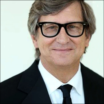
Rick Carter

Rick Carter is a legend in the field of production design. With Avatar and Star Wars VII: The Force Awakens, he designed two films that have each made over two billion in the box office. He’s spent a career teaming up with three of the greatest filmmaking visionaries who ever lived- Steven Spielberg, James Cameron and Robert Zemekis, to create such classic films as Jurassic Park, Forrest Gump, Back to the Future II and III. To date he’s won two Academy awards, one for Avatar and one for Lincoln. Most recently he designed Star Wars IX: The Rise of Skywalker. I connected to Rick in the middle of the worldwide Corona virus pandemic, with our industry on hold…

AS: Is all production and prep shut down for you because of the Covid 19 virus?
RC: It really is. There’s some prep going on but for the most part it’s shut down. People are trying to figure out when they can actually start up a production and how to do it because getting people together is not an easy task. Keeping people safe is the first and foremost thing. Secondarily, what kind of art can we create in this environment? It will have a profound impact on what movies are and how they’re made.

The job of production design is not going to be dependent on what we’ve had in this last epoch. Production design is not a static thing. Just the advent of computer imagery into the process caused a development that we’ve all had to adjust to, those of us who’ve been around for a while. And here comes another change and this one’s going to be very, very trying but I think it will lead to great solutions. Designers will have to really help design the production, not just what it looks like.

Lee Ha Jun

Lee Ha Jun designed arguably the greatest film of the 2020 Oscar season, the Korean movie Parasite. He was nominated for the best Art Direction Oscar and won the Art Director’s Guild award for Best Contemporary Production Design. The film itself won four Academy Awards, including Best Picture. His team built and dressed almost every set in the movie from scratch, including an entire city street that was flooded. I was elated to discuss production design with the artistic visionary behind this masterpiece.

A huge thank you to Juhee Yi of Neon for translating!

AS: Director Bong Joon Ho told me that you built a section of the city for the amazing flood scene in Parasite. Can you tell me a little about designing that exterior set?
LHJ: There is an actual location in Seoul that has a similar look but since we had to flood the street in the scene we built the whole neighborhood in a water tank. We went location scouting where there are still apartments that have history. I designed the set by looking at the photos from the location scout and also referred back to the semi-basement where I used to live as a university student. When I was living in the semi-basement I hated having a toilet full or mold but later I realized I could draw from that experience!

Mark Friedberg

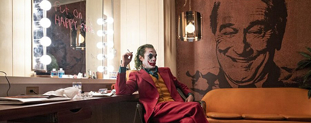
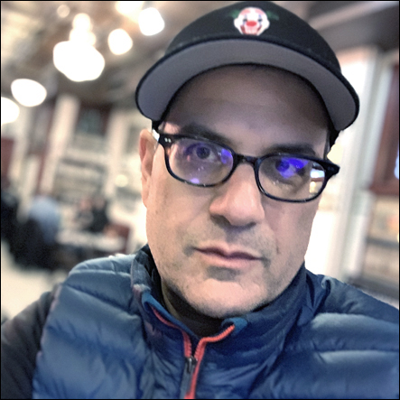
Mark Friedberg’s beautifully gritty design was the dark soul of Todd Phillip’s Joker movie. The film is an unconventional, uncompromising blockbuster that has surpassed the one billion dollar mark in the box office. Not all of Mark Friedberg’s movies have made over one billion dollars, however. His heart’s in the indie world and he’s designed a long list of indie classics from Wes Anderson’s The Life Aquatic with Steve Zissou and The Darjeeling Limited to the more recent Selma and If Beale Street Could Talk. And for Darren Aronofsky he created the giant biblical ark seen in the big budget epic Noah. Below is some deep insight into this design genius’ process.

AS: How do you go about creating the specific universe of a movie like Joker?
MF: The way I design is I want to understand the world before I make it. I’m not making a world and then trying to understand it. I’m not making sets and hoping they go together. I like to work from concept. There was this sense of the city being an oppressive force bearing down on Arthur [Fleck, the Joker] that was in the script. But there were also strong references to Taxi Driver and that era of filmmaking and to living in New York City at that time. It took a while with Todd [Phillips, director] and I driving around to figure out what our Gotham was, what was Arthur’s Gotham really. Everything in the visual world of the story both advances the plot but also cues us emotionally, in the way the score helps us understand what to feel and the costumes help us better understand the character.

Dennis Gassner

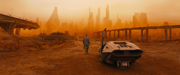
Dennis Gassner’s visionary work on Bladerunner 2049 earned him one of 7 Oscar nominations. Of those nominations, he took home an Oscar in ‘91 for his unique take on the 1940’s gangster film Bugsy. Before he designed Bladerunner 2049 or the innovative Sam Mendes war film 1917, he had been the exclusive James Bond production designer -he created the look for Quantum of Solace, Skyfall, and Spectre. These big budget extravaganzas are far removed from his early work on Coen brothers’ movies like Barton Fink and Miller’s Crossing…

AS: What drew you to the field of production design?
DG: My journey began in Vancouver, British Columbia and took me to Portland Oregon, Eugene Oregon, then on to Berkeley and Los Angeles. I’ve pretty much covered the West Coast. I was studying architecture at The University of Oregon when I went to see this technicolor film by David Lean, Lawrence of Arabia. It was my first Cinemascope film. The scale of it was so enormous and the power of the film was so awe-inspiring I said, Who was the architect of that? I wanted to know more and investigate the field of production design so I took my van and my two-year-old daughter and my wife and we moved to LA. I went to the Art Center School of Design, the old school on Third and Highland, and I connected to that world of thinking. They’d just started the film program and I got to make short movies. There was also graphic design and fine arts, transportation design and advertising design. It was thinking beyond anything that I’d experienced before, in a multitude of facets.

Guy Hendrix Dyas 2

When I saw photos of Guy Hendrix Dyas’ design work on Passengers my mind was blown. You may remember my interview with Guy back when he had his first Academy Award nomination for Inception but with Passengers he’d taken it to the next level. Here’s an update on his process…

AS: Is sketching as important to you now as it was the last time we spoke?
GHD: Sketching is all I do when I start a project. I’ve got this routine now where I’ll read a script and get an 8.5” x 11” sketchbook and basically sketch the entire film. This sketchbook becomes my bible. It becomes my go-to place when I’m thinking of handing out projects to my staff to develop.

AS: After your initial meeting with director Morton Tyldum did you then go off and create a lot of sketches to bring back to him?
GHD: I turned up to the initial interview with many of these sketches. I’d been given the script and was excited by it. This is a script that has no monsters, no guns, just raw science fiction in the greatest tradition of films like 2001 or even Silent Running. It’s a wonderful film because it makes you think about moral choices. It makes you think about love and life and your own existence. The script had been knocking around in Hollywood for many years and I never thought I’d get a chance at it. But when I was up for it I grabbed it, and ran with it.

Colin Gibson

colin_04

Colin Gibson invented a fleet of road warrior vehicles while designing the movie Mad Max: Fury Road, essentially becoming a “War Boy” himself in the process. A far cry from his more traditional work on Babe and Babe: Pig in the City, the world he brought to life for Fury Road was brutal and unforgettable and won him his first Academy Award…

AS: Your collaboration with director George Miller on Mad Max:Fury Road was mind-blowing.
CG: There’s nothing like collaborating with a towering imagination to give you a head start to mind-blowing. George showed me a room full of storyboards and no script and said, This looks like it’s right up your street. I didn’t know at the time that it was going to take quite so long! It was the year 2000, which was the same year as the Sydney Olympics and so it was either the Olympics or Fury Road and my back had been playing up so I took Fury Road. But it turned out to be slightly longer than a four year turnaround!

1 2 3 4