Laurence Bennett

People think of the technique and technical aspects of film at the time as being fairly crude. That’s not at all true. There were beautiful, artful, and very sophisticated techniques being used. There are tracking shots and crane shots in Sunrise that are absolutely beautiful. There is a crane shot on a boat coming into dock that just blows me away. There’s a tracking shot through a village that’s incredibly artful in its reveal and its contribution to the mood of the scene.
AS: The movie is about the transition from silents to talkies, and some have compared that change to our transition today into visual effects-heavy movies. How do you feel about that as a production designer? Did you use a lot of visual effects in The Artist?
LB: One of the themes of The Artist is the fear-inducing capability of change in peoples’ lives. George closed himself off, shut down, and became less than he might have been when he so firmly rejected the new technology. I think there are obviously parallels in what we’re seeing today in our industry. When we were making the picture Michel used to joke that everybody else was hot on 3D and we were making a 1D picture! While it’s not strictly true it’s indicative of how against-the-grain we were in doing this.
All the same, we knew that we would need to use whatever technologies were available to us. Pencils and computers work side-by-side in the art department. I work in pencil, the set designers worked in pencil and in computer modeling. All these things are tools. Aside from the one-sheets and the newspapers that are montaged into scenes, the visual effects are some set-extensions and a little bit of digital replacement for some of the street scenes and one interior on location. Phillipe Aubry was the vis effects supervisor and he came over (from France) and worked with us for much of the shoot. He was absolutely a delight. One of the most fun, easy, workable people I’ve ever encountered. He just made it really simple. We showed him research for how we thought city backgrounds might be extended and he did a great, great job of it. Made it look seamless.
AS: I noticed how you also used some painted backdrops from the old days…
LB: Yes, onstage we only used painted drops. There’s really nothing that I could find still in existence from the twenties or thirties but we used the oldest primarily black and white drops we could find. When I came across a couple of drops from Casablanca in black and white down at JC Backings I had to figure out how to put one of them to good use! Michel responded immediately and we decided to make one of Peppy’s films set in Morocco. It was like unrolling a holy relic.
AS: Did you paint the sets in black and white?
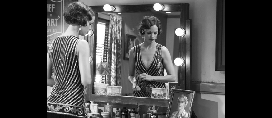
LB: The sets that were shot as film sets within the picture were rendered in black and white. And the stage sets that we built that were meant to be portraying real life in the picture were rendered in naturalistic colors.
AS: You did tests to see what they would look like in black and white?
LB: Yes, we tested all the wallpapers and fabrics and paint samples before we committed. My department and [costume designer] Mark Bridges’ department continued testing things in black and white during the shoot as questions arose.