K.K. Barrett

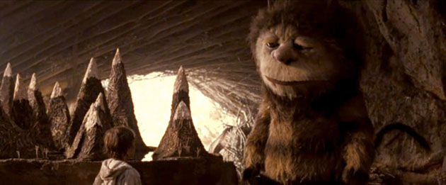
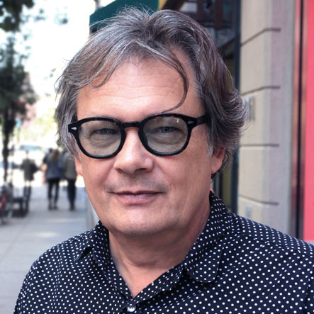
K.K. Barrett has created unforgettable art working with some of the world’s most original filmmakers: Spike Jonze on Where the Wild Things Are, Being John Malkovich, Adaptation, and Her (for which he was nominated for an Oscar); Michel Gondry on Human Nature; Sophia Coppola on Lost in Translation and Marie Anoinette. He had just finished the Stephen Daldry-directed Tom Hanks movie Extremely Loud and Incredibly Close when I met him in the DUMBO section of Brooklyn where he was prepping Karen O.’s psycho-opera Stop the Virgens.
KK: I always wish somebody would win an Oscar for production design and talk for just a minute about the simplicity of the most purely correct, but minimalist, piece of production design of the year. A film where people edit out visually what doesn’t belong until everything is pure and correct for the film, rather than the bells and whistles and the over-the-top and in-your-face design where you forget who the characters are. You can art direct a film without painting anything, without building anything, and still control a palette, still control a mood and make it a very strong statement.
AS: Reducing until you get to the essence…
KK: There’s only so much space in a film. A good example is when a book gets edited down to a script. Subplots are lost, characters are lost. You can only make so much of a statement in the hour and a half, two hours you have for the film. Production design is often the same way. You can only do so much. You don’t need to show the world that isn’t discussed or isn’t affecting the characters. Even though it may exist down the street. Sometimes the biggest process is saying, No, that has nothing to do with them, it distracts from them, let’s take that away. It would distract or confuse the character’s existence, or their dilemma, or their happiness. You just have to take things away until you’re concentrating on the character and the affected environments.
AS: The sets shouldn’t overshadow the characters…
KK: That’s a given unless you’re making a summer thrill-ride. There’s design for entertainment and then there’s design for drama. Sometimes it works hand-in-hand. Sometimes it’s dramatic and it’s entertaining. It doesn’t mean it shouldn’t be entertaining but it should always be engaging. Sometimes entertaining is not engaging. I like to think that you can help the audience have an experience on their own by absorbing things rather than telling them what to think all the time. A summer film usually tells the audience what to think and is very nervous about not telling them what to think. They don’t want them ever to get bored. Don’t get me wrong, I buy a lot of popcorn and enjoy those movies, I am just trying to give thought to the more unsung statements of design.

Pingback: Grant Major