Guy Hendrix Dyas 2.0

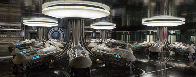
The first drawing for the exterior of the ship was done before my initial meeting with Morton. He saw it and he said, You got the job. The idea was that we wouldn’t just create a large bulky ship moving through space where you press a red button and there’s your gravity. We treated our design scientifically. The three hulls rotate around a central core propulsion unit, which would probably be nuclear. A crew halo at the front rotates around the ship at a different speed, creating gravitational pull. It separates the passengers from the nuclear propulsion unit. Otherwise they would die of radiation poisoning before they reached their destination 120 years later. The halos of light on our hibernation pods are there to feed vitamin D to the skin of the bodies to keep them alive and healthy. We try to think of everything in terms of how this would work scientifically. Still, our designs are perhaps a little more fanciful than some of the films we’ve seen in recent years that have based their design thread on NASA.
AS: So you relied less on research at places like JPL?
GHD: The project happened at such breakneck speed that we didn’t have time to bring in any experts- it really was based on my own schoolboy science and my background as an industrial designer. It was very fast for a film of its scale. We were ten weeks in development of the artwork and then we quickly went to Atlanta. Ten weeks to build everything. And then Chris and Jen turned up for a seventy-eight day shoot.
AS: Do you still make clay models like you did for the fortress in Inception?
GHD: Yes, although less clay and more CAD and architectural models. The spaceship model we developed purely as a 3D model in Rhino. In this ship design it was very important for me to have a link to 2001 and one of the most iconic spaceship of them all, the rotating space-station. Once you’ve established the frontal view the audience thinks they know what they’re looking at and then as the ship turns they start to see the rotation in the side-view which gives the audience a completely new perspective on that concept.
AS: Did you do any 3D printing?
GHD: There was a lot of 3D printing to demonstrate what those shapes were like in physical terms. However, a lot of the interiors were designed as regular architectural models and illustrations. One of the things my team and I pride ourselves in is getting the sets to look as close to the illustration as we can. So many times coming up as a young illustrator and concept artist myself, I’d produce amazing illustrations and then I’d see the set and it would look nothing like it.
I have an inherent connection to the concepts now and a desire to see them reach the screen so I dictate very strongly that the designs stay the course and look the way they do in the illustrations. There’s a wonderful thread through these illustrations to the final sets.
A lot of people accuse me of doing the illustrations after the fact. I promise you the set designs are first! In many cases we will get a still frame of our 3D model and then render over it for the set design. And when we later take that 3D model apart to build the set it matches perfectly.